Project Background
Problem:
Carbon Wines is a luxury wine brand representative. They have designed experiences around the different identities of their winery clients to truly capture the essence of what makes Napa wine great to begin with. Carbon needs to update their current site to keep up with current design trends as well as entice new customers to join their members only club
Solution:
Redesign Carbon’s landing page with current design trends that reflect the brand as well as the wineries they represent. Create an exclusive wine club, for serious wine buyers, and collectors. The Website Must be Responsive across platforms.
Process Flow
Due to time constraints, I had to work fast, and come up with what Carbon’s new page could look, and feel like. I created a simple process flow map to show the various stages of progress to its final end product.

Competitive Benchmarking
With my years of wine expertise, and having a solid understanding of Carbon’s Team, I set out to collect what most embodied the idea of luxury. Though eclectic it set the tone for what Carbon’s new look would be about.

Sketch
After gathering all the Information, I grabbed my sketchbook and started sketching out the Carbons homepage. When I was satisfied with my thumbnails, I chose the strongest of them and took the drawing further. In my process, I like to work out 90% of my design ideas on paper first, then transcribe them to digital. This allows me to be faster as well as gives me a solid foundation to build on.


Mood Board
I created my mood board based off of images inspired from Carbons Instagram, and Website. I also pulled inspiration from my own time working in Napa Valley’s wineries . For color palette inspiration, I chose colors from Carbons variety of brands they represent. Keeping with current trends I incorporated elements of Pantone’s 2022 Color: Very Peri.

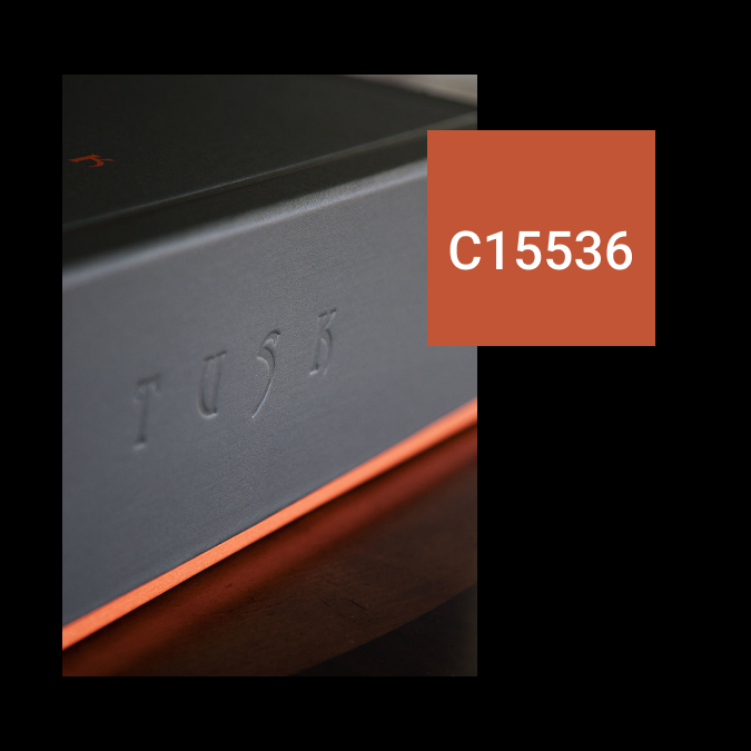
Tusk Wines package design is the epitome of a luxury wine product. The color palette and texture really gives the feeling of sophistication as well as a contemporary feel .
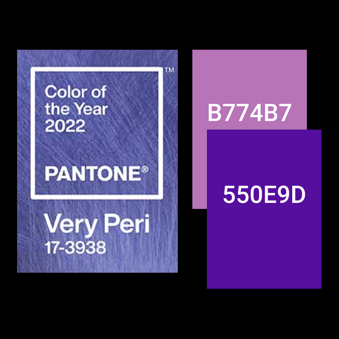
Pantones 2022 Color: Very Peri, Is a great way for Carbon to keep with current design trends I used it subtly to add color and coition throughout the site.
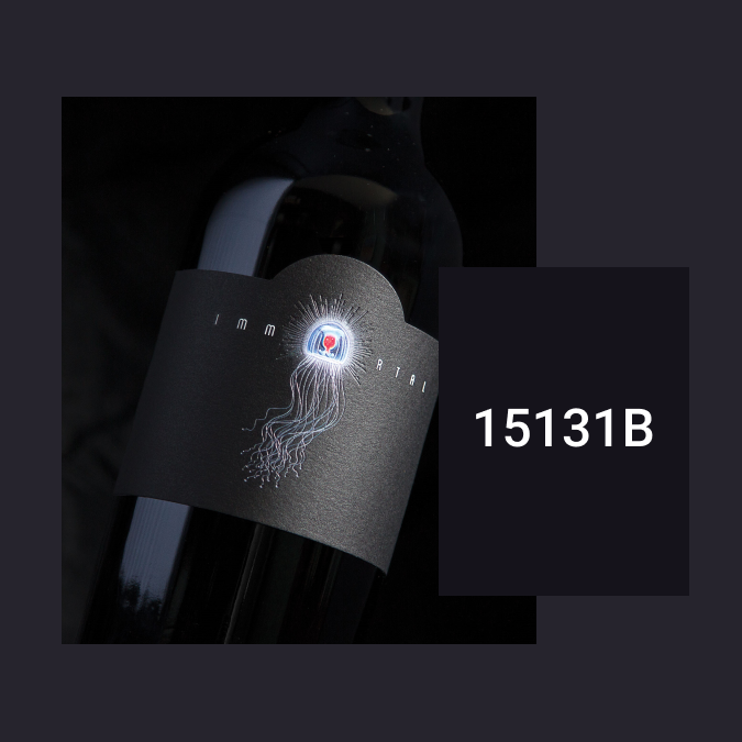
Dramatic lighting on Wine bottles gives a cool smokey black that gives depth and dimension by using various shades of black

Concept Re-Design
To give the full experience of what Carbon has to offer. I decided to go with a short film showcasing the best of the Napa Valley lifestyle that sets the tone for what it means to be a club member with carbon.
Note: Not an actual video, image example only.
Desktop

Mobile

Brand Representation
Brand Representation

A major component missing from Carbons current page is brand representation. With the use of a Carousels feature I was able to better showcase the wine brands they represent. This helps visitors see what wines they would be privy to when purchasing through carbon. In addition for any boutique Winery needing a brand rep; having your wine represented next to other big industry names gives them instant buyers attention.
A major component missing from Carbons current page is brand representation. With the use of a Carousels feature I was able to better showcase the wine brands they represent. This helps visitors see what wines they would be privy to when purchasing through carbon. In addition for any boutique Winery needing a brand rep; having your wine represented next to other big industry names gives them instant buyers attention.
Conclusion
Conclusion

I am pleased with what I was able to complete. I believe that the site represents the people and the place that carbon represents.
However, If I could go back and change something, I would have spent more time designing other pages for the prototype, specifically a winery profile page. It would have been a fun challenge to explain the sense of taste and style of wine through visuals and words.
The biggest obstacle I ran across, was the amount of minimal information given to me, and with the information given, extracting as much design out of those short conversations. I also really had to scale down drastically due to time constraints, I believe a prototype would have been beneficial for adding to the experience.